Apiculus 2.0, the latest iteration of the Cloud platform, presents a new and invigorating user experience (UX) design that embraces a fresh, modern, and bold approach.
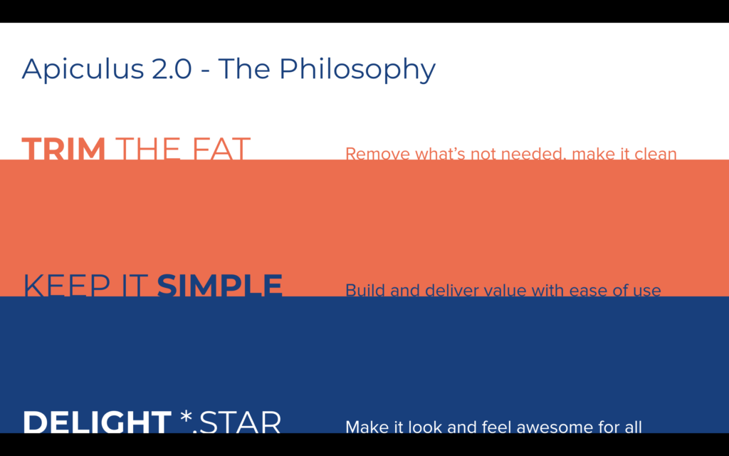
This update was driven by a philosophy that sought to “trim the fat,” eliminating unnecessary elements to create a clean and clutter-free interface. The focus on “keeping it simple” ensures that users can easily access and derive value from the platform’s features.
Furthermore, Apiculus 2.0 strives to “delight *.star,” aiming to provide an awesome look and feel for all users. In this blog, we will delve into the key changes and improvements brought about by Apiculus 2.0’s fresh UX design.
Also Read: What more should a CMP offer?
What is Fresh?
1. Completely New Way of Managing Services
Apiculus 2.0 introduces a revolutionary approach to managing services. The platform now leverages the concepts of Availability Zones, Cloud Collections, and Custom Catalogues.
- Availability Zones allow users to deploy services across multiple geographic regions, enhancing resilience and redundancy. Any unique combination of a CloudStack deployment, zone, and hypervisor/clusters.
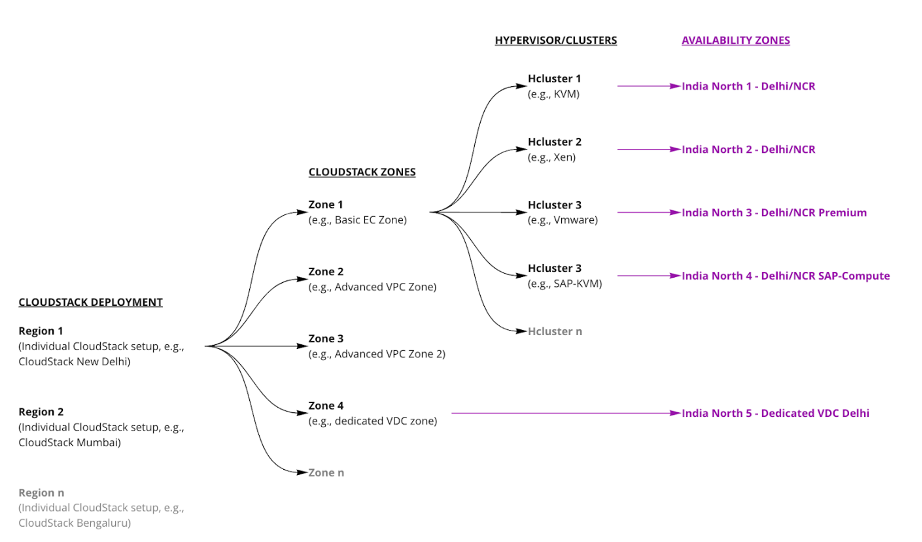
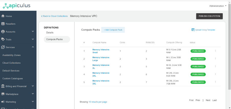
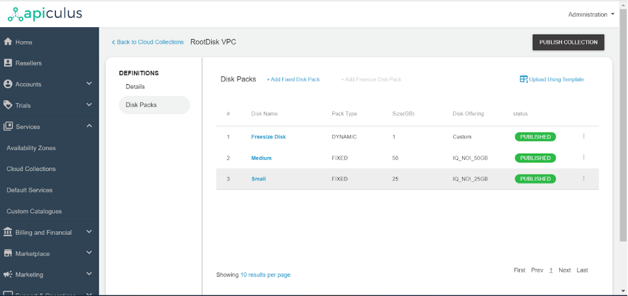
- Cloud Collections enable users to group related services together for easier management and resource allocation. Groups of offerings of the same type of components. Offerings or collection types are as follows:
- Operating Systems
- Compute
- Disk
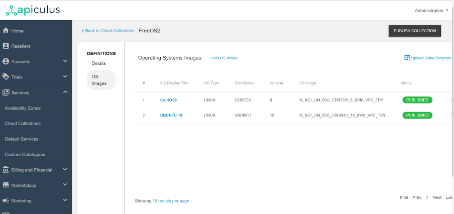
So, grouping various OS types of Images, disk packs, or compute packs is called a collection.
Also Read – Scaling New Heights: Exploring the Latest Advancements in Apache CloudStack
OS Collection
Compute Packs Collection
Disk Packs Collection
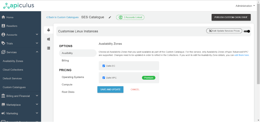
- Custom Catalogues offer a curated selection of services tailored to specific user needs, streamlining the service selection process. It’s a dedicated Catalogue for a specific customer or customers. It comprises all the services defined by the cloud service and provides availability, billing options, various OS, compute packs, and disk packs.
2. Apiculus CloudConsole Subscriber Interface
The brand-new Apiculus CloudConsole interface empowers subscribers with an intuitive and seamless experience. With improved navigation and enhanced visuals, users can now easily monitor and manage their services in real-time.
The CloudConsole is designed to enhance user productivity and make interactions with the platform effortless.
What is Refreshed?
Onboarding and Dashboard Experience:
Apiculus 2.0 gives special attention to the onboarding process, ensuring that new users can quickly familiarize themselves with the platform.
The revamped onboarding flow offers step-by-step guidance and intuitive tutorials, enabling users to set up their services efficiently.
Also Read – Apiculus 2.0 – Faster, Better, More Resilient
Additionally, the dashboard has been reimagined to provide a unified view of all essential information, allowing users to monitor their services and performance at a glance.
Conclusion
Apiculus 2.0’s fresh UX design brings a transformative experience to subscribers, with its clean, simple, and delightful interface. The new approach to managing services through Availability Zones, Cloud Collections, and Custom Catalogues revolutionizes how users interact with the platform.
Furthermore, the refreshed onboarding process, dashboard, and Apiculus Kubernetes Service demonstrate Apiculus’s commitment to user satisfaction and continuous improvement. As Apiculus 2.0 ushers in this fresh era of UX design, subscribers can look forward to a more productive and enjoyable experience in managing their services.

Kshitish is a ‘startup expert’ and has been involved with early stage startups, seeing various phases of growth, for more than 15 years. A specialist in Product Management, User Experience, Technology and Product Growth/Strategy, Kshitish is a seasoned entrepreneur with deep expertise in building enterprise products and horizontal/vertical SaaS. Kshitish did his PG in Product Design from NID, Ahmedabad.

